Critical Internet Studies Institute
A digital identity that balances academic credibility with digital activism
Challenge
The Critical Internet Studies Institute faced a complex identity challenge. Founded by two established academics with distinguished individual careers, Drs. Chris Gilliard and Joan Donovan needed a unified digital presence that properly represented their new joint venture.
Their work investigating surveillance systems and combating misinformation required a digital presence that could speak with authority to institutions while remaining accessible to digital activism communities. The challenge wasn't simply creating a website—it was defining who they were as a united entity and translating that identity into a cohesive visual language.
Solution
Rather than approaching this as a standard institutional website, we developed a system where every visual element serves both function and concept.
We began by deeply understanding the Institute's position at the intersection of academic research and public engagement. Working in collaboration with Sam Hinds, this insight drove our editorial approach—creating a design system that balanced scholarly credibility with digital-native awareness.
Typography became our primary tool for establishing this balance. We paired Andersen (a literary serif from 205TF, known for its use in independent publications) with GT America (a clean, functional sans-serif from Grilli Type). This combination creates a visual tension that mirrors CISI's own work: rigorous academic research presented for real-world impact. We reinforced academic credentials through traditional typographic techniques like Chicago-style paragraphing—first paragraphs flush left with subsequent paragraphs indented.
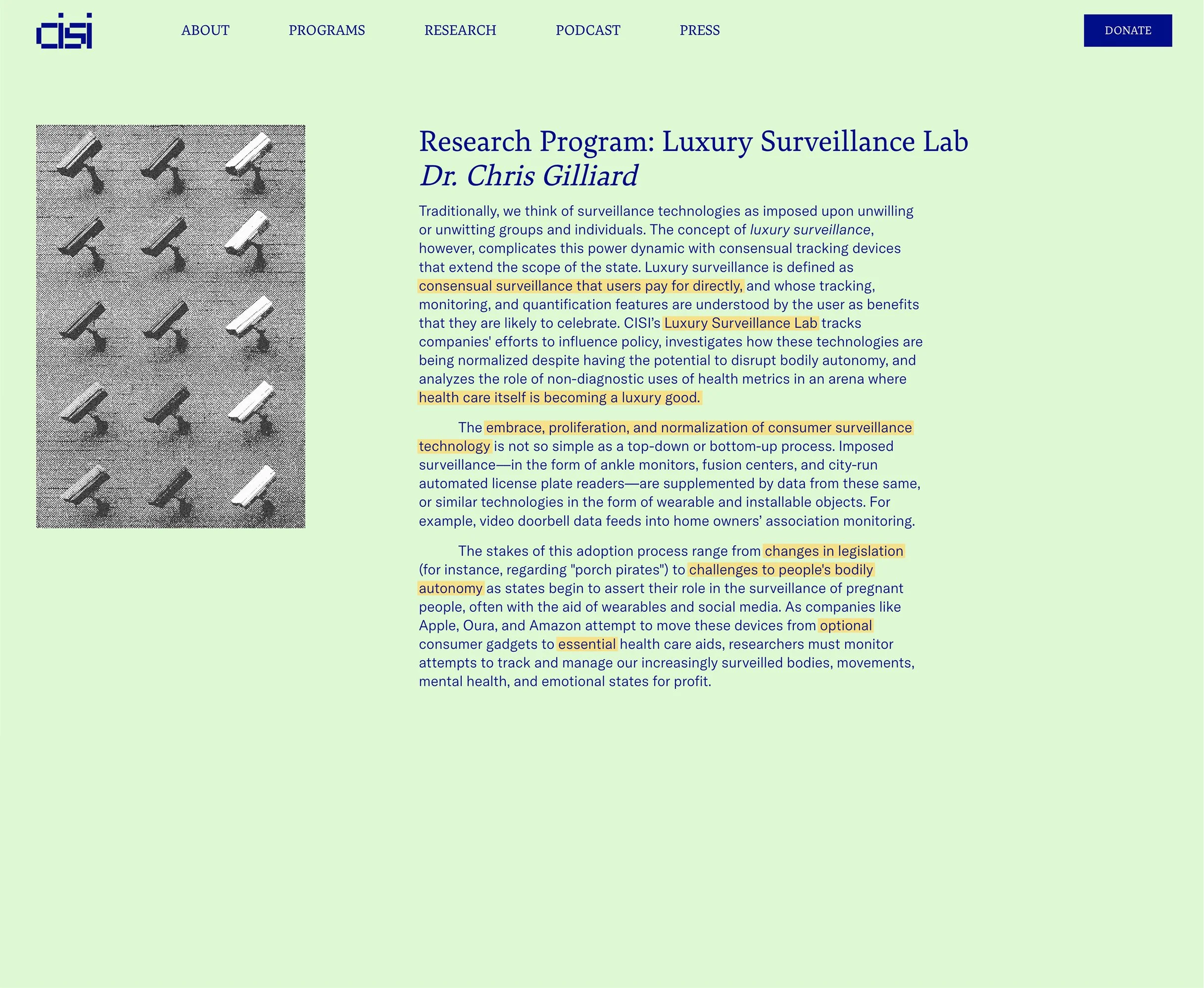
Image treatments became integral to CISI's message rather than mere decoration. We created two distinct approaches: newsprint textures for team photos that establish credibility, and pixelation with blue tint for media imagery that visually references digital surveillance and information manipulation—the very subjects of CISI's research.


Typography
Andersen, with its distinctive serifs and literary character, brings a refined intellectual quality to headlines and important text. This typeface, created by 205TF foundry, was selected specifically for its resonance with independent literary publications—establishing cultural credibility without appearing overly traditional or staid. GT America provides the perfect contemporary counterpoint, handling body text with clarity and precision while maintaining a modern sensibility.
Color as Communication
Throughout the website, we employed a system of light, monochromatic background colors to distinguish different content areas. Programs, podcast pages, research sections, and about pages each received distinct background tones, creating subtle visual cues for navigation while referencing the aesthetics of academic papers and independent literary journals. This approach adds informational hierarchy without compromising the site's clean, focused design.


Visual Direction
Image treatments became integral to CISI's message rather than mere decoration. We created two distinct approaches: newsprint textures for team photos that establish credibility, and pixelation with blue tint for media imagery that visually references digital surveillance and information manipulation—the very subjects of CISI's research.


Logo
We redesigned the existing logo using the established pixel-based elements to maintain continuity with their previous visual identity that followers might recognize. This thoughtful evolution created two versions to serve different contexts: a compact "cisi" for digital applications and a full lockup for formal settings.

Independence by Design
Understanding that academics often manage their own digital presence, we built the site with standard Squarespace functionality. To support ongoing content creation, we developed custom Figma and Photoshop templates that automate the creation of consistent image treatments—allowing CISI team members to maintain visual coherence when adding new content without requiring design support. This system gives CISI complete independence to expand their research areas while preserving their distinctive visual identity.
Results
The new digital identity succeeds in positioning CISI at precisely the right intersection—scholarly enough for academic credibility, contemporary enough for digital relevance, and distinctive enough to stand out in both worlds.
By creating a cohesive design system, we've given CISI the tools to build their reputation as they expand their important work investigating surveillance systems and combating misinformation at scale.
"Denys was perceptive, sharp, and genuinely curious about our work. A strong collaborator across the board, he quickly grasped both the aesthetic and conceptual elements of the brief, making the creative direction process seamless. I especially appreciate his knack to ask us tough questions while simultaneously indulging unusual influences with enthusiasm."
— Sam Hinds