the blue-eyed barbarian:
Denys Putilin, Olena Kvitkovska
Sector:
Purpose-driven Fashion Brand
Website:
store.heralbony.com
What we did:
Creative Direction
Website Design & Development
Year:
2024–2025
Fonts:
Garamond
Noto Sans


Client and the challenge
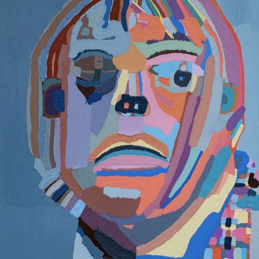
HERALBONY is a Japanese fashion brand that transforms art by creators with intellectual disabilities into silk scarves and accessories. The founders started the brand because their brother has an intellectual disability. The model is personal, and it works: creators who once earned basic subsidies now earn professional-level incomes. HERALBONY won the 2024 LVMH Innovation Prize and decided to enter the European market through Paris. They needed a standalone French e-commerce site, separate from the Japanese store.
The problem
The Japanese homepage is a long scroll. Product, story, approach, business model, history, all on one page. In Japan, where communication tends to be implicit and layered, this works. You build trust by showing everything.
A European audience reads differently. We needed to restructure the site for a market where a fashion brand has to look like a fashion brand first. But the mission is what makes HERALBONY different from every other silk scarf company. Lose it and the brand becomes generic. Lead with it and you risk looking like a charity.
Design solution
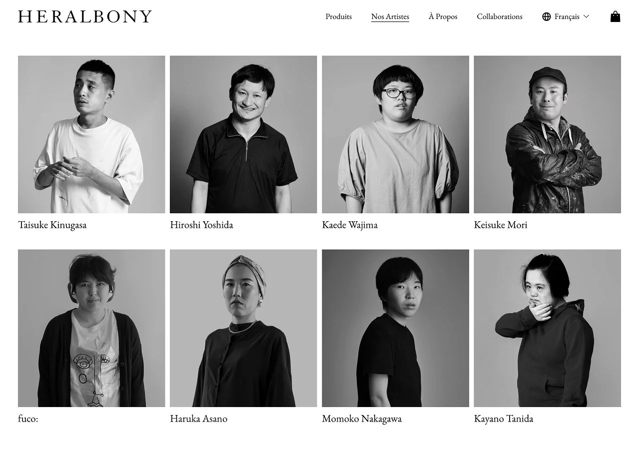
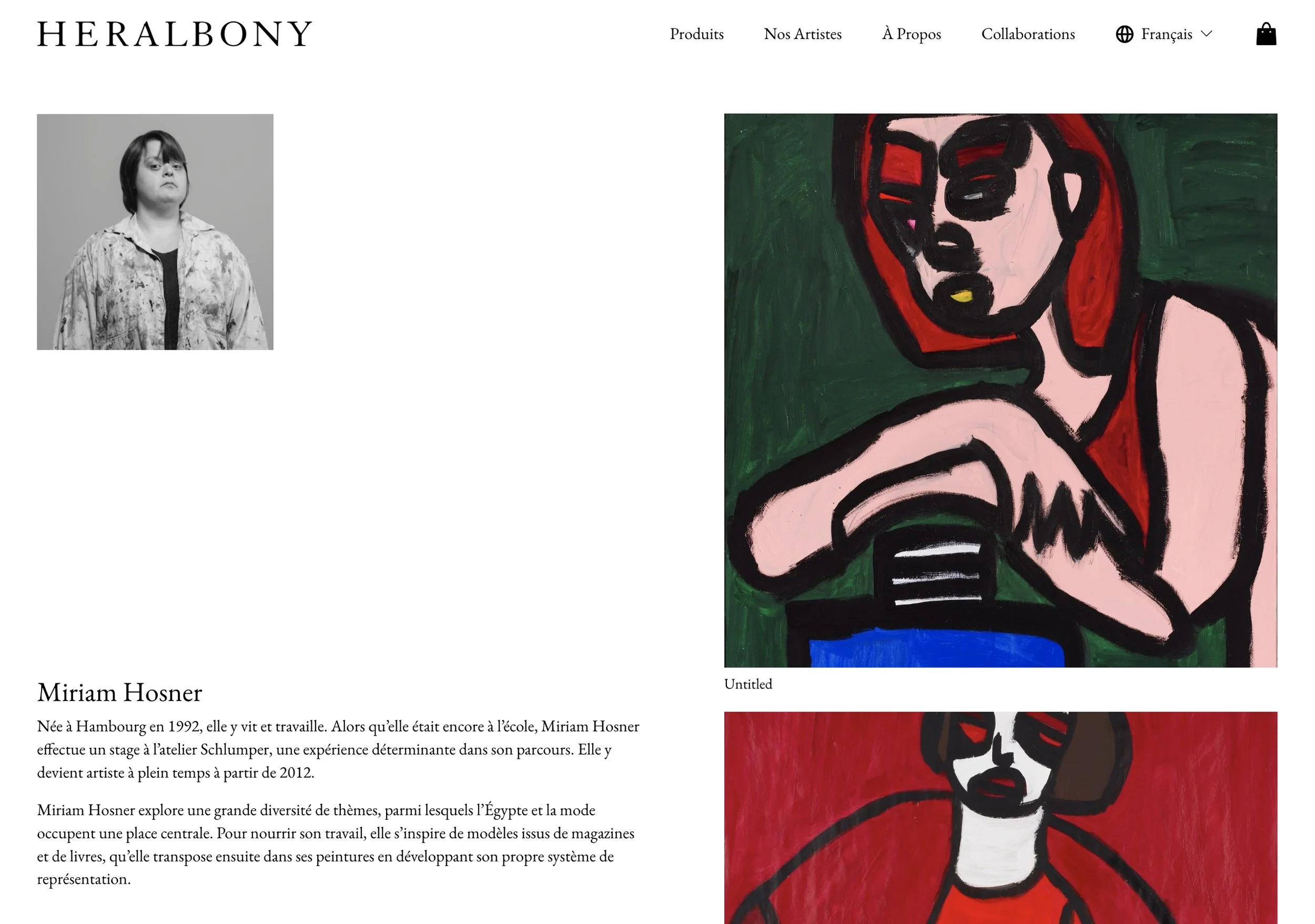
The site is built around two tracks: products and artists. They run separately but link into each other throughout. On a product page, you see who made the artwork behind it. On an artist page, you see their biography, their work, and their products link back to the shop. The products need the artists behind them to mean something. The artist profiles need the products to show that this is a functioning business, not a gallery.
The homepage sequences the two. It opens with a video of an artist working in their studio, then moves into commerce: product photography, lookbook images. Then a short section on the mission and a section introducing the artists. The rhythm alternates between product and purpose so the site never settles into one register. A visitor who arrives for the product eventually meets the artists. A visitor who arrives for the mission eventually finds products to buy.
Cultural adaptation
The Japanese site builds trust by being comprehensive. For the French site, we kept the depth but restructured how visitors reach it. The homepage is selective: commerce and mission in alternating sections, with the business model and company history on separate pages for those who want to go deeper. The site reads fast at first but the exploration journey is rewarding.
This was my first time working with a Japanese client. Before our early meetings, I researched how the work culture might differ and raised what I found with the team directly. We added a creative direction step before any design work: references, layout ideas, how we might use their content. It gave us a shared discussion before I built anything, and the team appreciated the transparency.
Typography
Garamond and Noto Sans were set in the existing brand book. The pairing works across both languages and maintains consistency with the Japanese site.
Squarespace build
The site is built on Squarespace, giving HERALBONY's team the ability to manage the store, update products, and publish content independently as they expand beyond silk scarves.
Results
The site launched in time for HERALBONY's first exhibition during Paris Fashion Week. It was the brand's introduction to the European market, and the feedback at the exhibition confirmed the approach. I visited the show at Le Marais and met nearly everyone I had worked with for the first time. The site did what it needed to do: when visitors at Fashion Week looked up the brand afterwards, they found a French store that presented HERALBONY as a fashion brand with a reason to exist.
"Great work! Brilliant design, very cooperative attitude. We're so grateful."
— HERALBONY team