Studio Vuono
Client:
Milja Bannwart is a Finnish-Swiss ceramic artist and industrial designer based in Brooklyn. Her journey with clay began in childhood, spending summers in Finland playing with foraged clay, fishing and swimming. She later studied Industrial Design and has worked as a product and packaging designer in New York City for nearly two decades. In 2023, she returned to her roots in ceramics and established her Brooklyn studio, Vuono. Milja designs and handcrafts sculptural ceramics that blend artistry with functionality.

Strategic Challenge:
When Milja reached out to us, she had already established her studio in Brooklyn and created her first collection. She sought our help and expertise for comprehensive brand direction, from logo creation to visual content guidelines to e-commerce design.
Finding Clarity:
By immersing ourselves in Milja’s work and influences, we uncovered our strategic direction. Like the design icons who inspire her, Eva Zeisel, Tapio Wirkkala, Oiva Toikka, her work originates from a deeply personal creative vision rather than market demands. Milja’s unique journey as an industrial designer with an artistic practice led to the perfect metaphor for the brand: precision meets natural form.
Brand Direction:
The brand identity needed to reflect both Milja's artistic sophistication and her connection to Nordic design heritage. Our first strategic decision was to simplify the name from "Studio Vuono" to simply “Vuono", Finnish for fjord, creating a more refined presence that speaks directly to the geological formations inspiring her work.
The logotype design emerged from careful observation of Milja's process. In her slip-cast molds, we noticed a round form with a section removed, resulting in an organic shape- a perfect reflection of her work's balance between precision and natural imperfection. This discovery led us to Prophet, a typeface by Berlin-based ABC Dinamo studio, which bridges handcrafted and mechanical sensibilities through a combination of warm calligraphic curves and clean geometry. The distinctive treatment of the 'O' and 'V' in Prophet perfectly captures this duality.


Creative Direction:
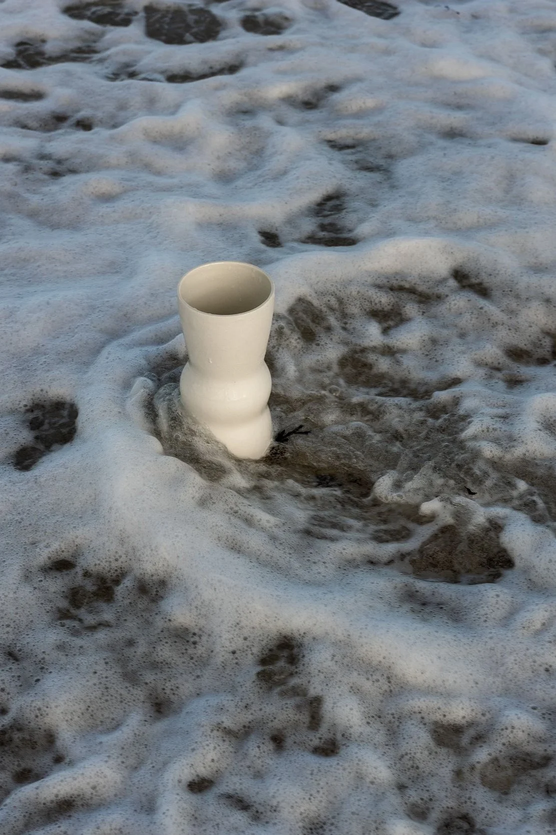
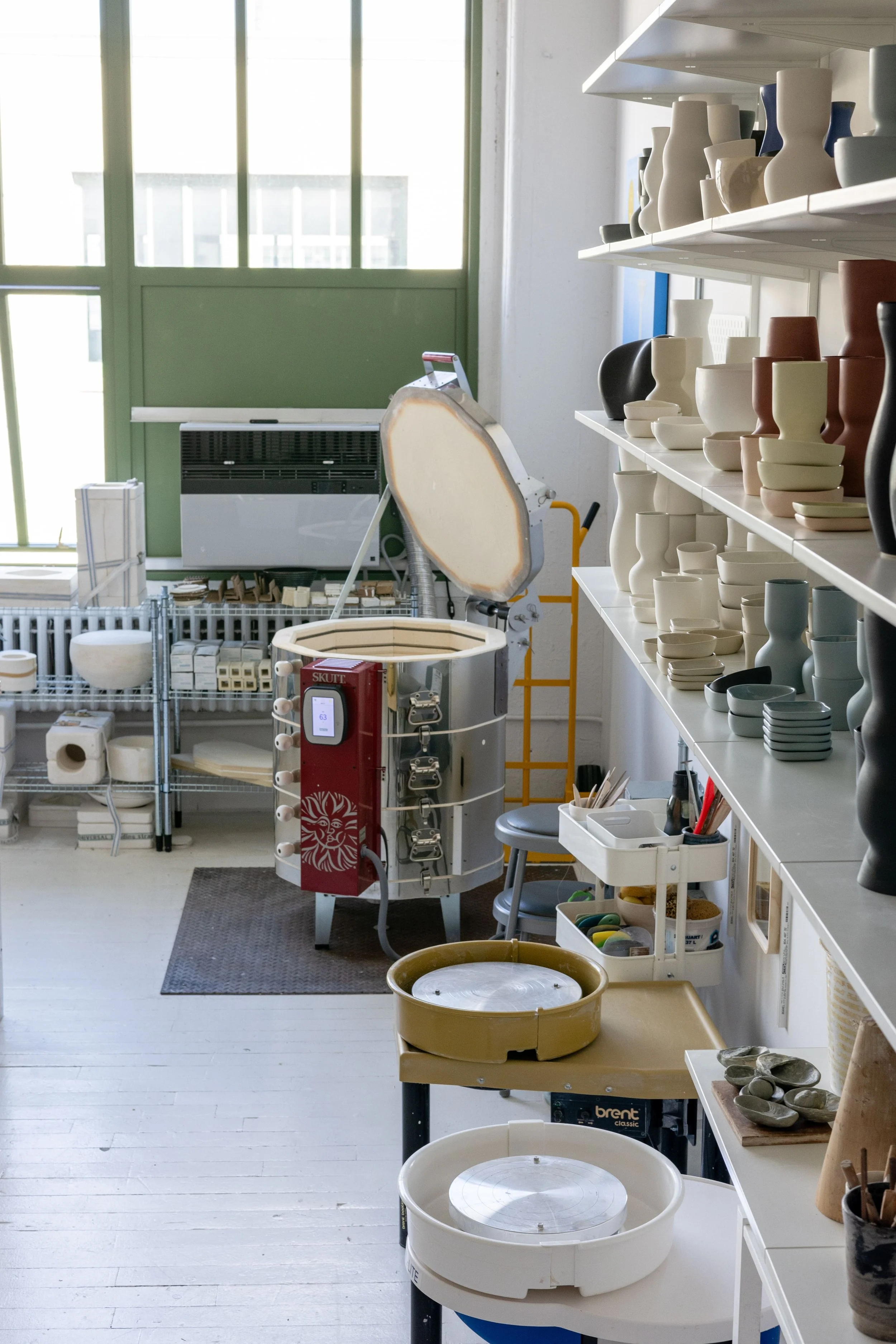
The visual strategy mirrored Milja's own creative process, drawing inspiration from nature and translating it into designs informed by craftsmanship and precision. We recommended photography that placed the ceramic pieces in dialogue with their inspiration — vessels set against ocean waves and glacial rocks. This captured both the refinement of the work and its natural origins. Studio documentation shows the human touch behind each piece while maintaining the brand's elevated aesthetic.


Website Design:
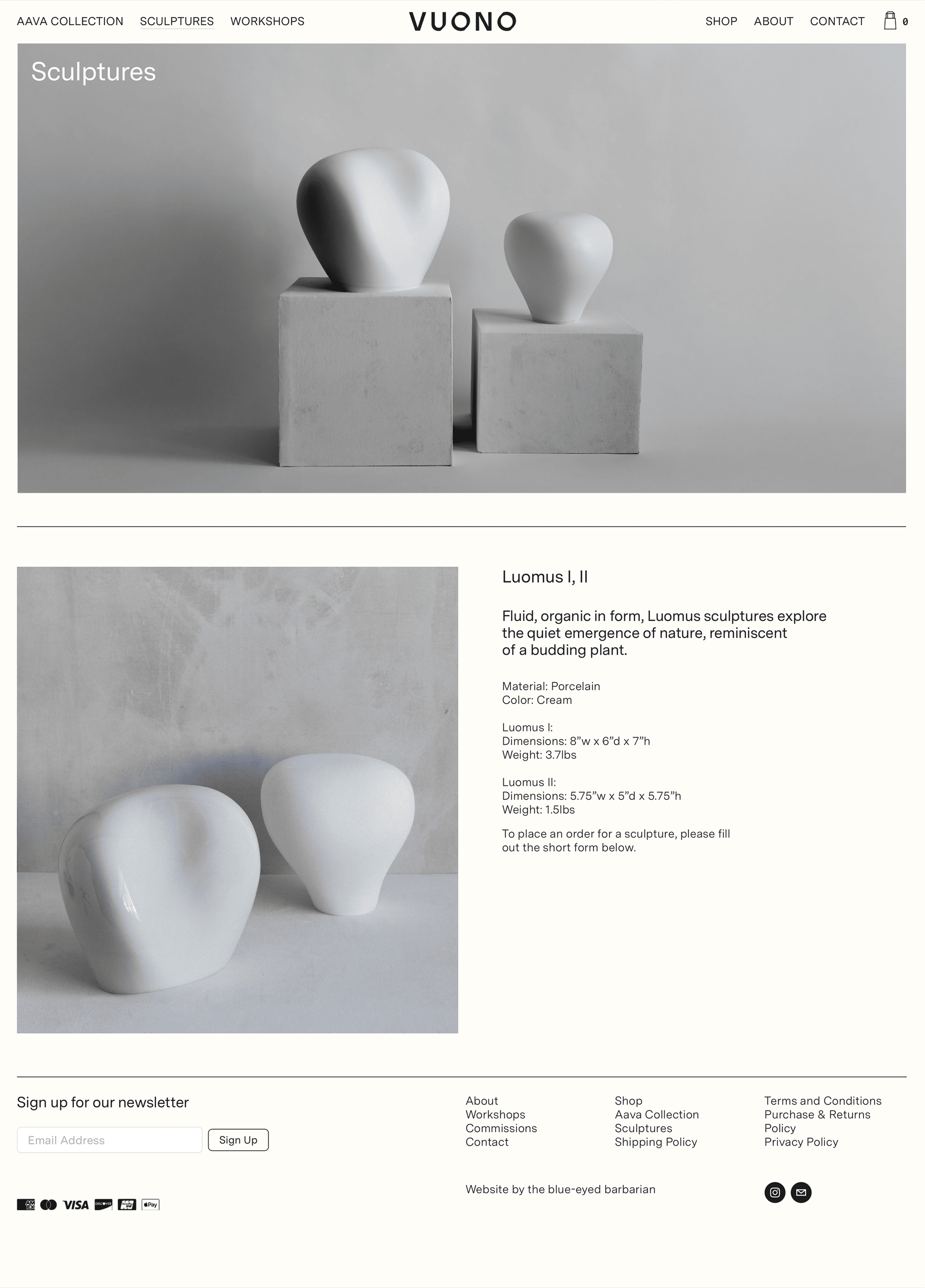
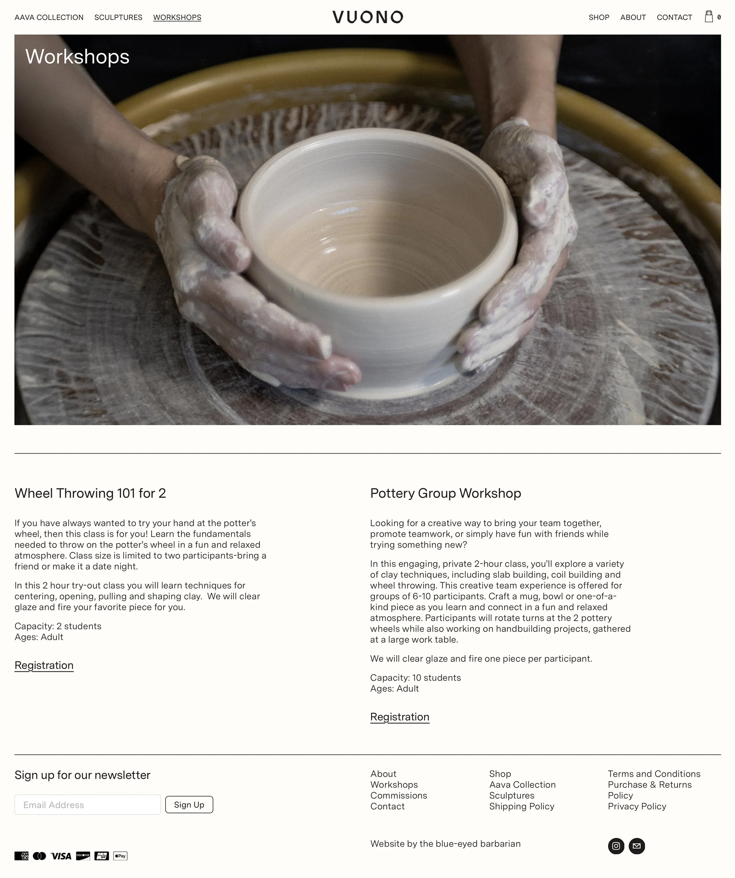
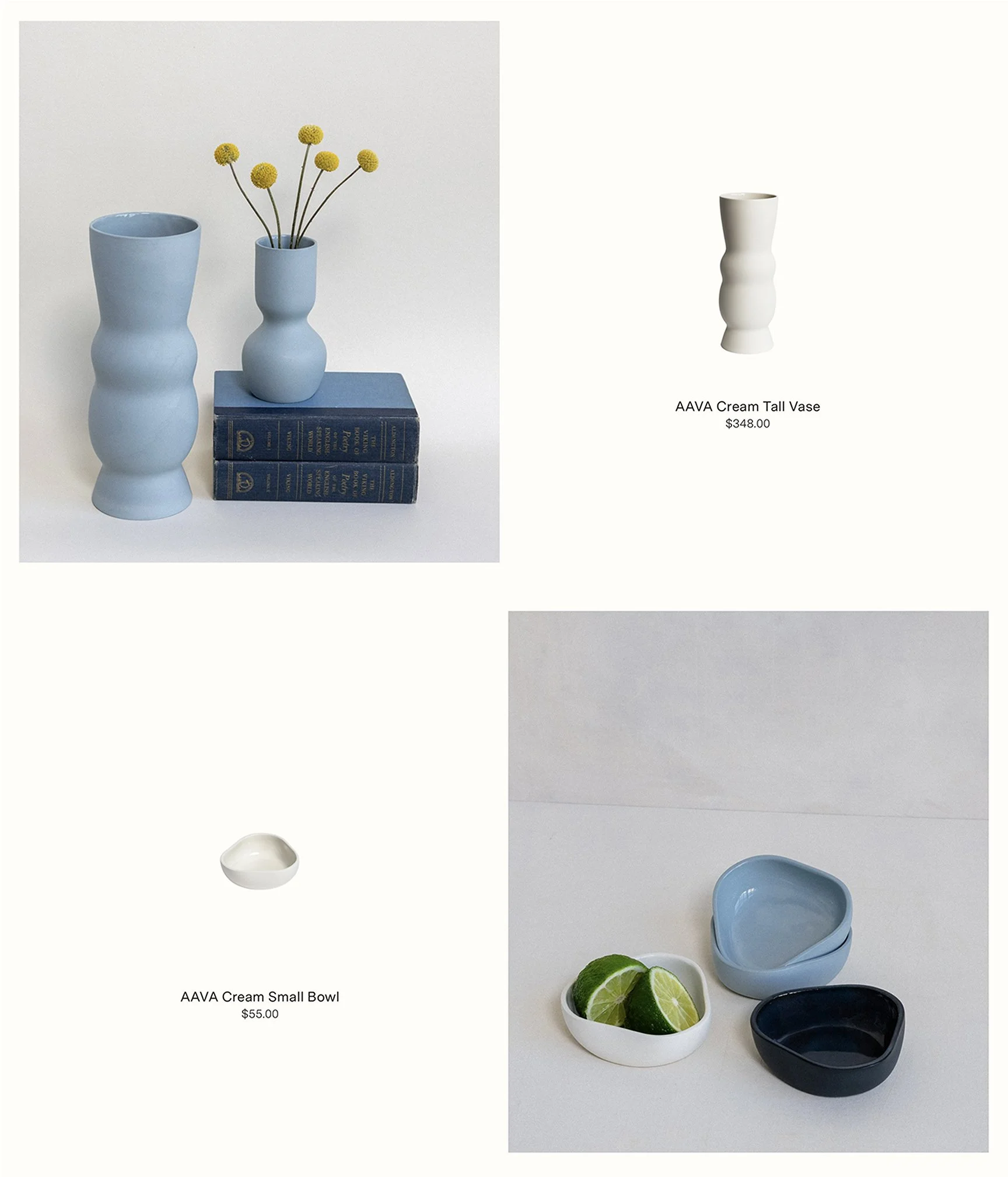
The website blends artistic presentation with seamless commerce. Our design creates a clear narrative flow- opening with a curated collection view that establishes product quality, then revealing deeper layers of story through nature imagery and studio glimpses. Product pages balance detailed documentation with poetic context, giving each piece room to breathe while providing essential information for collectors.
We built the site on Squarespace, aligning with Milja's hands-on approach to her practice. Just as she maintains direct control over her artistic process, the platform allows her to independently manage her growing collection and evolving story. The result is both a sophisticated sales platform and an authentic expression of her creative vision.


Typography:
For the website typography, we sought a complementary typeface that would maintain sophistication while prioritizing clarity and readability. We selected Messina Sans by Luzi Type, which echoes Prophet's refinement but with more conventional letterforms, ensuring the content remains accessible without competing with the brand identity.

Messina Sans, by Luzi type


Communication Strategy:
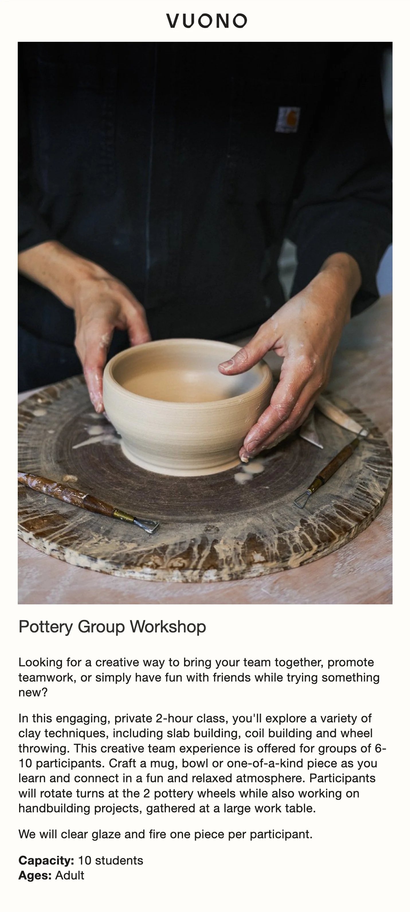
Beyond the website, we developed guidelines for ongoing dialogue that reflect Milja's commitment to craftsmanship and community. Newsletter templates serve distinct purposes, from pop-up store announcements to workshop invitations, while maintaining the brand's elevated voice. Like her teaching practice, these communications foster meaningful connections with her growing audience.
Results & Impact:
The completed brand system accomplishes something remarkable: it translates Milja's personal journey with clay into a refined design language. Each element, from the imperfect circle in the logotype, to the imagery of waves meeting the shore, tells part of her story. Most importantly, we created tools that support her independence while maintaining a unified vision, allowing her practice to evolve while staying true to its origins.
"I am incredibly pleased with the work of the Blue-Eyed Barbarian in designing my website. Denys is a true visionary who went above and beyond the initial scope, delivering an exceptional site that is not only highly functional and beautiful, but also deeply reflective of my work and my personal story.
The Blue-Eyed Barbarian team provided comprehensive creative brand direction, including logo design, visual content guidelines, and e-commerce design. Their professionalism and thoughtful guidance throughout the entire process were truly outstanding. The final website is a genuine expression of my practice and at the same time a seamless e-commerce platform."
— Milja Bannwart, Vuono